Crumpl
PAPER RECEIPTS IN A DIGITAL WORLD
Every year in Australia receipts cost the environment 4.5 billion litres of oil, 1.5 million trees and 249 billion litres of water. After completing our recent research study we found 60% of user’s would find it useful if their receipts and warranties were digitized and organized all in the one app.
How might we help users to adopt a paperless system so that the process of receiving a receipt is thoughtless and automatic whilst reducing paper waste?
TIME: 4 weeks (1 week sprints)
TEAM: N.Bathan, D.Huckel, Sk.Ng
ROLE: UX / UI & Branding
DATE: September 2022
Project Goals
Our goal was to develop an app to improve the user experience of saving receipts and being able to recall warranties when needed. Our biggest focus was to research and explore the attitudes and frustrations of people towards paper receipts in order to produce a viable digital solution. Qualitive data would be essential in creating a successful product.
Tools & Methods
Interview Planning
We created proto-personas so we could start hypothesizing who the users would be and what they would need. This gave a strong start in developing a user interview plan so we could gain insight into the needs, behaviors, and motivations of the potential product users.
We planned in person user interviews as well as google surveys to collect quantitative and qualitative data. We were particularly interested in the qualitative data, as this would give us insight into what our users biggest emotional stresses are and how we could resolve them.
How do you feel about paper receipts?
Do you keep receipts?
How do you store
and organize your receipts?
User Insight #1
So what did we learn? We found out that a majority of people simply don’t keep receipts and 74% of participants only keep receipts in case of warranty. In whole, the overall attitude towards paper receipts is one of annoyance.
In regards to keeping receipts, a common answer from our research started to confirm a pattern for us that users are only keeping receipts in case of warranty claims and only for large price tag items.
User Insight #2
Our final core question was to find out how users are currently organising their receipts and were they already implementing a digital solution? We began to understand from this that most people just collect important receipts in a drawer, in a box or sometimes somewhere in their email, if they were lucky enough to visit a store that provides this option. All comments that were made in the interviews from users about digital receipts were positive.
User Insight #3
After our research we had realized a few of our early on ideas were debunked during our interview process. We thought that this app would be more about helping people organise their receipts at tax time but came to discover that it was mostly everyday people looking for an easy way to keep important receipts in case of warranty returns. We also originally thought that people might like the idea of having digital user manuals stored in the app but after our interviews it became very clear that most people don’t even keep user manuals or will google it if an issue arises.
These insights allowed us to simplify and streamline our energy into perfecting what the user's would actually want to see in the app.
Meet Meghan
We developed a user persona to create a reliable and realistic representation of what our key audience would look like. This allowed us to have a deeper understanding of our user's behavior and needs.
Competitor Analysis
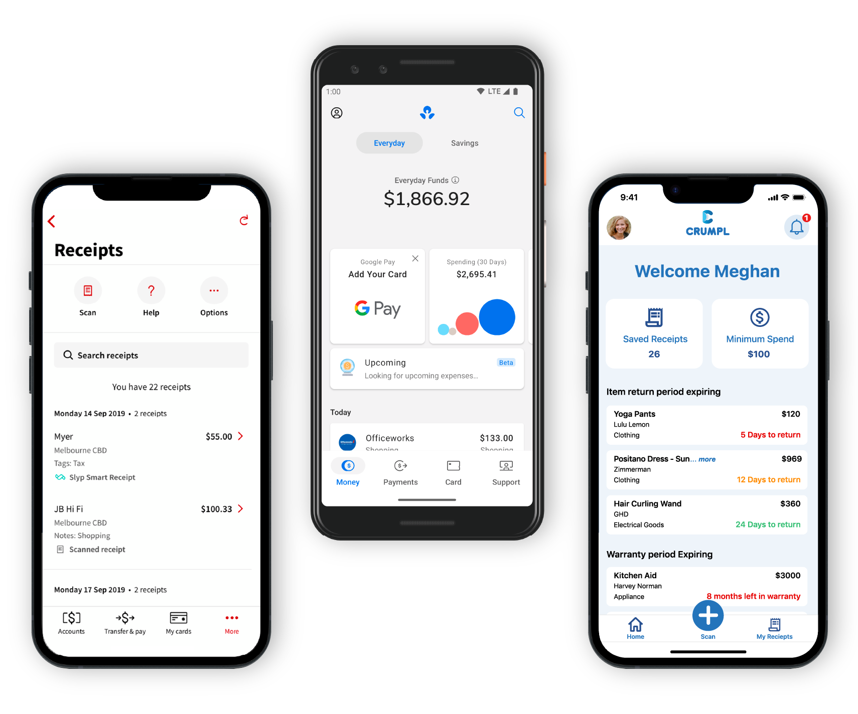
To understand how we could enhance the app we conducted a competitor analysis of two direct and indirect competitors. This allowed us to find our strengths and potential areas of opportunity in the market. From this we knew the features that would be essential to include would be an option to manually scan a receipt with your phone camera and warranty expiration reminders.
We also identified from this analysis that being a new app there would be no brand credibility and as we would be handling very sensitive financial information we would need to employ a UI design that would seem familiar and comfortable for users. We gained inspiration from banking apps to help mimic the trust users have with financial institutions.
Crumpl
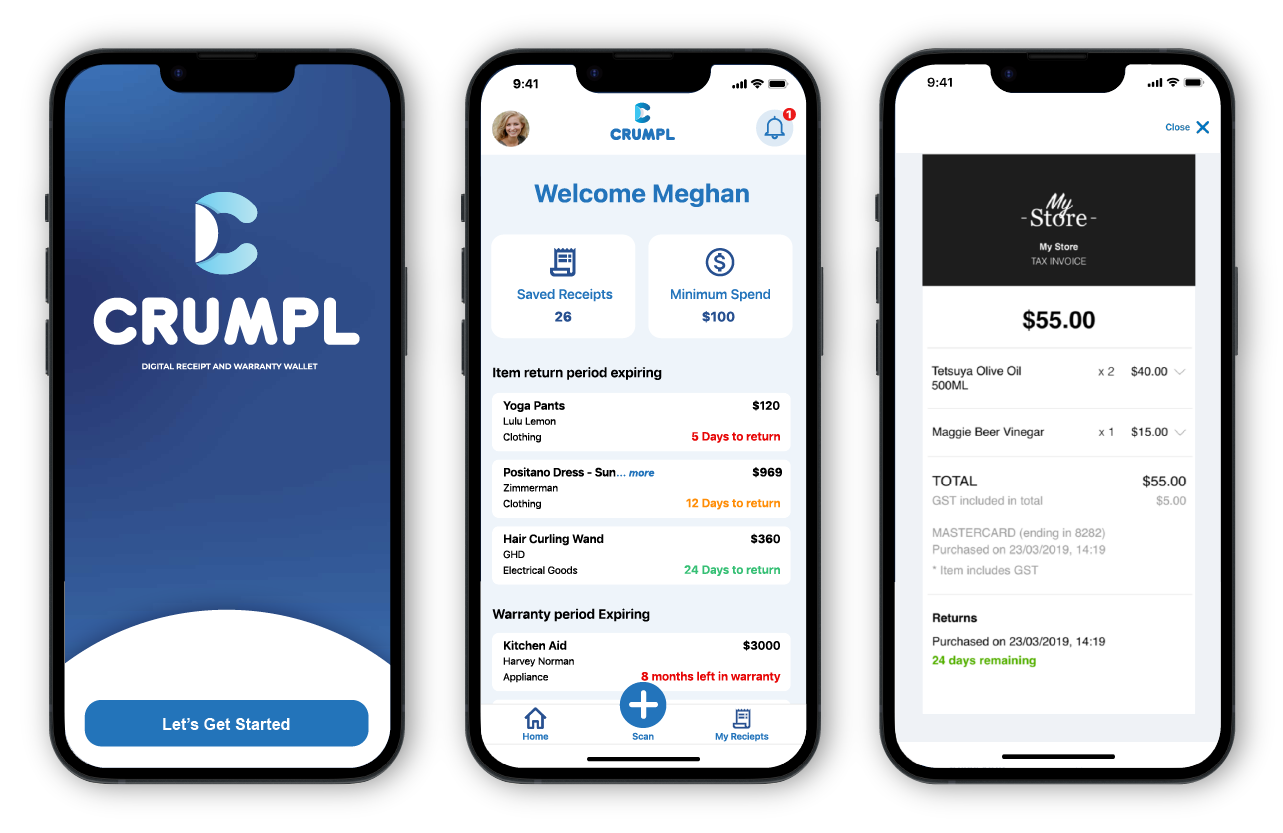
Now that we have all the research and user insights defined, without further ado let us introduce Crumpl.
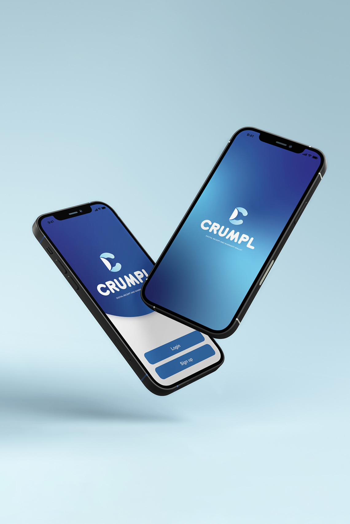
Crumpl, a digital receipt and warranty wallet. It helps everyday people organize and archive their important receipts and warranties without the clutter of paper receipts. Tap and go and let Crumpl automatically store these documents in your digital wallet for a cleaner and greener future.
User Scenarios
We devised user scenarios and storyboards so that the purpose of the app was clear and concise. It was important for us to develop these scenarios so the whole team could understand the needs and wants of our users and how the app will solve the user’s problem.
Wireframes
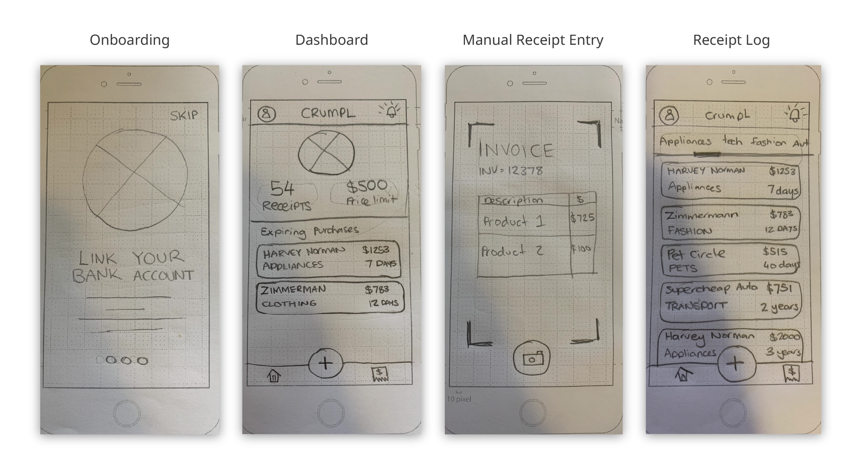
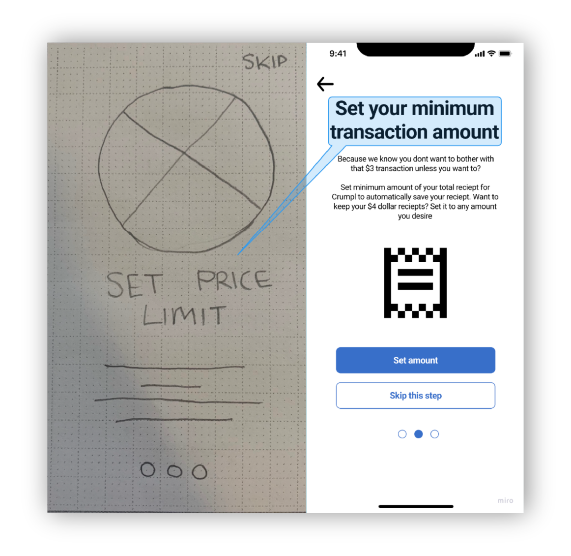
After plotting out user flows we began designing rough wireframe sketches. We tested these initial paper prototypes so we could start iterating the designs. This allowed us to use our time efficiently as we could quickly and effectively change up the designs.
User Testing
We conducted user testing sessions throughout the Lo and Mid fidelity prototype stages to gain user feedback. In whole the tests were successful yet some confusion was raised around certain terminology used. One of the features of the app is being able to set a minimum transaction amount so Crumpl will only save receipts over a certain dollar value. This eliminates the need for scrolling past all of those $4.50 coffee receipts and other digital clutter the user may not see value in. We originally identified this feature as a “set price limit” but users did not fully understand the concept so we iterated the terminology based on user feedback.
Mid-Fidelity Prototype
Please feel free to explore the mid-fidelity prototype.
You can expand the screen by using the button on the top right hand corner.
Future Oportunities
The next step for Crumpl would be to develop the high-fidelity prototype so that development opportunities could be expanded on.
In terms of internal features in the app, having the ability to categorize receipts based on personal and work expenses would be beneficial. Further to this, having the ability for users to manually add a PDF receipt they may receive in an email form would be advantageous.
Selected Works
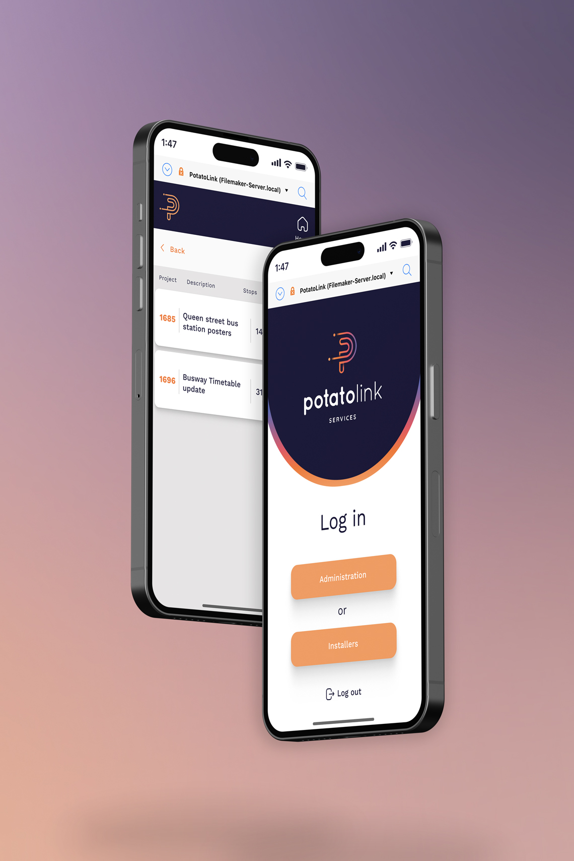
PotatoLinkUX / UI Redesign
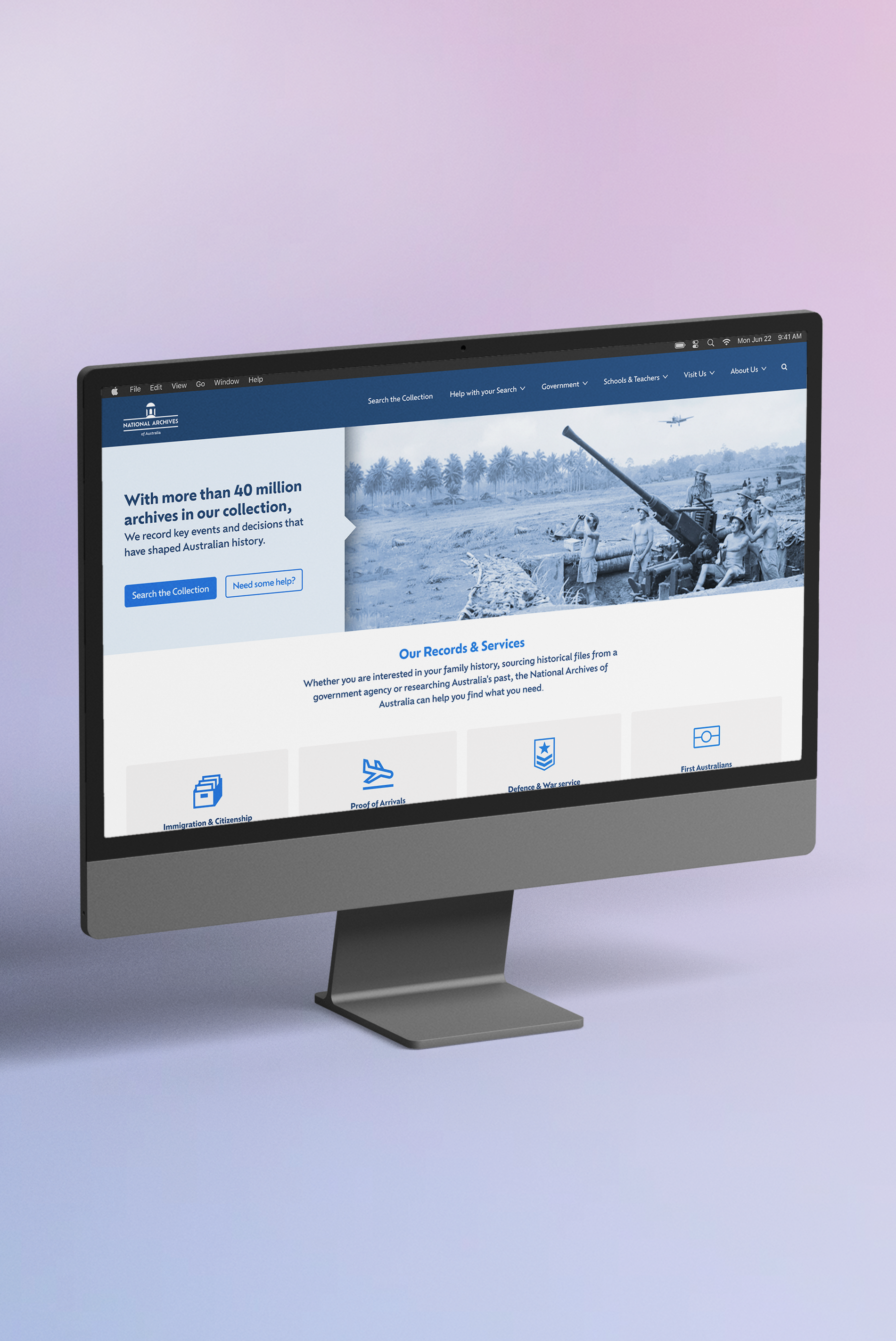
National Archives of AustraliaInformation Architecture
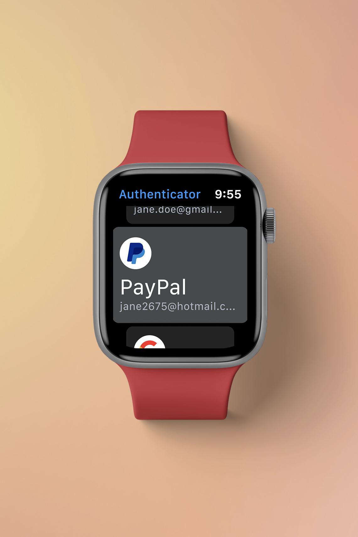
Google AuthenticatorSmart Watch Design

CrumplPaper Receipts in a Digital World
Contact
© Toren Vansleve
Gold Coast,
Queensland, Australia
Email: hello@torenvansleve.com
Linked in: www.linkedin.com/in/toren-vansleve